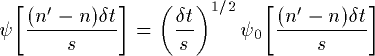
In Figure 2a we see an example of a wave "packet", of finite duration and with a specific frequency. One could imagine using such a shape as our window function for our analysis of variance. This "wavelet" has the advantage of incorporating a wave of a certain period, as well as being finite in extent. In fact, the wavelet shown in Figure 2a (called the Morlet wavelet) is nothing more than a Sine wave (green curve in Figure 2b) multiplied by a Gaussian envelope (red curve).
Assuming that the total width of this wavelet is about 15 years, we can find the correlation between this curve and the first 15 years of our time series shown in Figure 1. This single number gives us a measure of the projection of this wave packet on our data during the 1876-1890 period, i.e. how much [amplitude] does our 15-year period resemble a Sine wave of this width [frequency]. By sliding this wavelet along our time series one can then construct a new time series of the projection amplitude versus time.
Finally, one can then vary the "scale" of the wavelet by changing its width. This is the real advantage of wavelet analysis over a moving Fourier spectrum. For a window of a certain width, the sliding FFT is fitting different numbers of waves, i.e. there can be many high-frequency waves within a window, while the same window can only contain a few (or less than one) low-frequency waves. The wavelet analysis always uses a wavelet of the exact same shape, only the size scales up or down with the size of the window.
where s is the "dilation" parameter used to change the scale, and n is the translation parameter used to slide in time. The factor of s-1/2 is a normalization to keep the total energy of the scaled wavelet constant.
where the asterisk (*) denotes complex conjugate.The above integral can be evaluated for various values of the scale s (usually taken to be multiples of the lowest possible frequency), as well as all values of n between the start and end dates. A two-dimensional picture of the variability can then be constructed by plotting the wavelet amplitude and phase.
Figure 3 shows the power (absolute value squared) of the wavelet transform for the NINO3 SST data. The (absolute value)2 gives information on the relative power at a certain scale and a certain time. A plot of the amplitude and phase would show the actual oscillations of the individual wavelets, rather than just their magnitude.
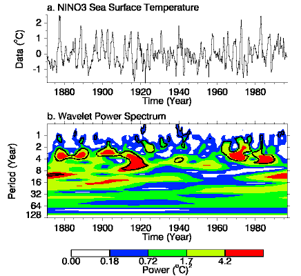
Comparing Figures 1 and 3 it is now much clearer that there was large power in the 2-7 year ENSO period during both the earlier and latter parts of this century. In addition we can now see hints of a 16-year oscillation as well as power at even lower frequencies.
The wavelet transform also gives information on changes in frequency that may have occured. Thus, from 1960-1990 the ENSO time band (2-7 years) seems to have undergone a slow oscillation in period from a 3-year period between events back in 1965 up to about a 5-year period in the early 1980s.